The Truth About Interior Paint Design: Light vs. Dark Colors
November 18, 2026
Picking a new shade for a living room or kitchen involves more than just finding a swatch that looks nice under store lighting. The right interior paint design changes how a space feels and functions on a daily basis. At Jacobsen Brothers Painting, we see firsthand how specific shades impact the perceived size and mood of a room. Understanding how light interacts with different pigments saves homeowners from costly applications they end up disliking.
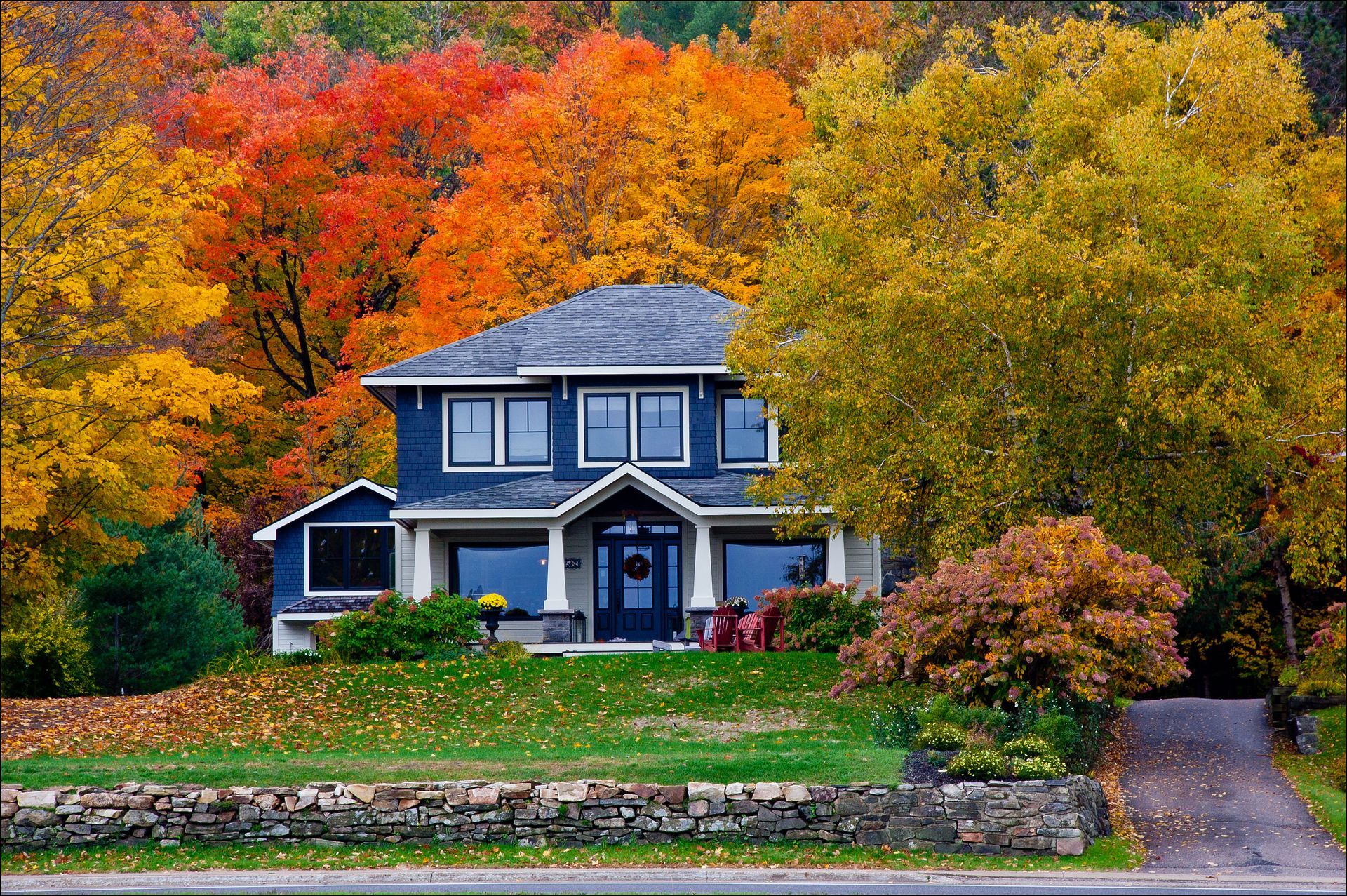
Many property owners assume dark walls automatically make a room feel cramped and uninviting. The reality of color theory is much more nuanced and depends heavily on natural light exposure and architectural features. Choosing appropriate colors can refresh a home and enhance its appeal. We help clients navigate these choices to find the perfect balance for their unique floor plans.
Here is a look at what we cover:
● The impact of light colors: Expanding your visual space.
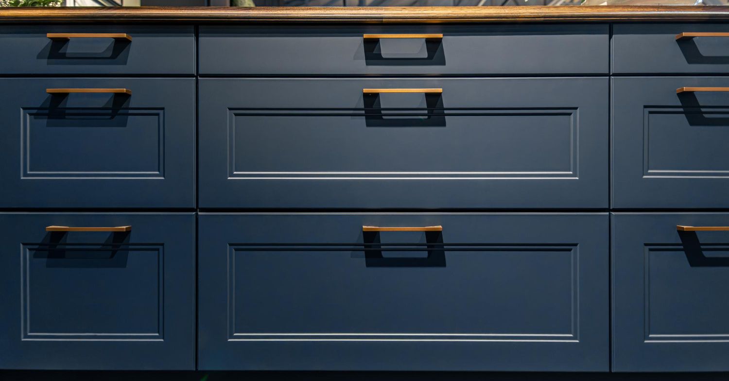
● Using dark shades properly: Adding depth and focus.
● Accent color placement: Drawing the eye to the right features.
● Finish types: Choosing between flat and gloss options.
Expanding Space with Light Colors
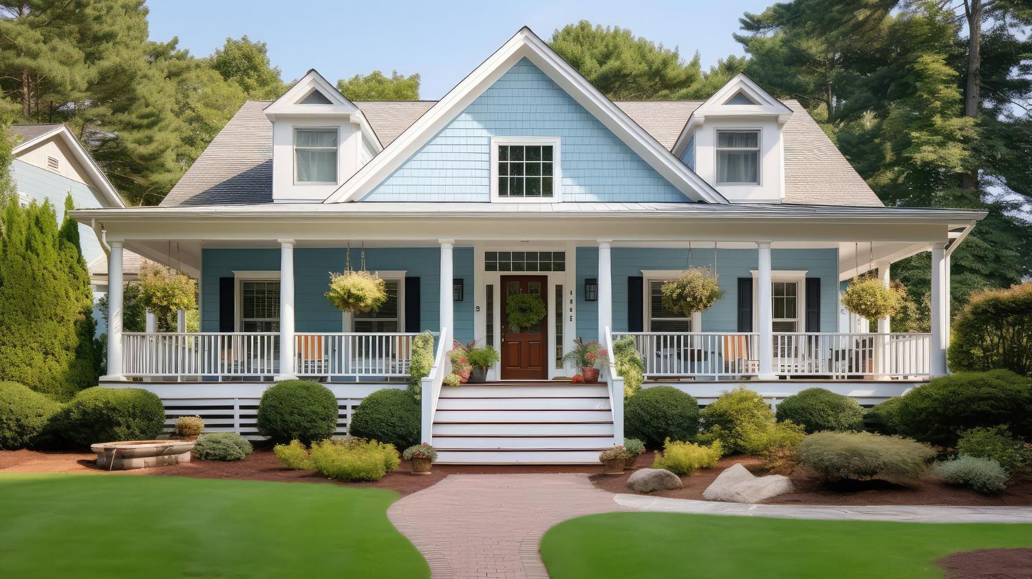
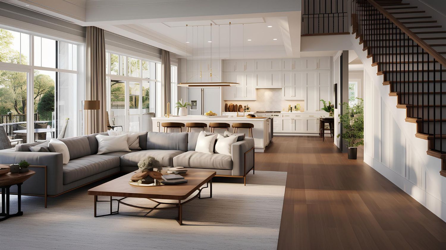
A frequent concern from homeowners is what colors they should choose for their homes. This often involves questions about trends, resale value, how light affects color, and coordination with other design elements. Color preferences can vary over time. Current trends in paint color collections can be seen from major paint companies such as Benjamin Moore and Sherwin Williams. Some rules of thumb state that light colors and white make a home look larger, while darker colors tend to make the home blend in more. Light shades reflect sunlight beautifully, opening up tight hallways and small bedrooms.
Highlighting Features with Accents
Once the main walls have a fresh coat, drawing attention to specific details becomes the next priority. Any accent colors should be used on elements that are attractive, as the color will draw your eye to them. Highlighting a well built mantel or a clean archway adds character without overwhelming the room. Ensuring a smooth surface with proper drywall patching beforehand makes those focal points look flawless.
Selecting these focal points and matching the right shades takes a practiced eye and a collaborative approach.
► Client Experience: "Your team consulted with me for colors and their attention to detail was unparalleled! We love the finished product and willbe hiring them for every paint need in the future."
Taking the time to consult on these decisions ensures the final look matches the original vision perfectly.
Selecting the Right Sheen
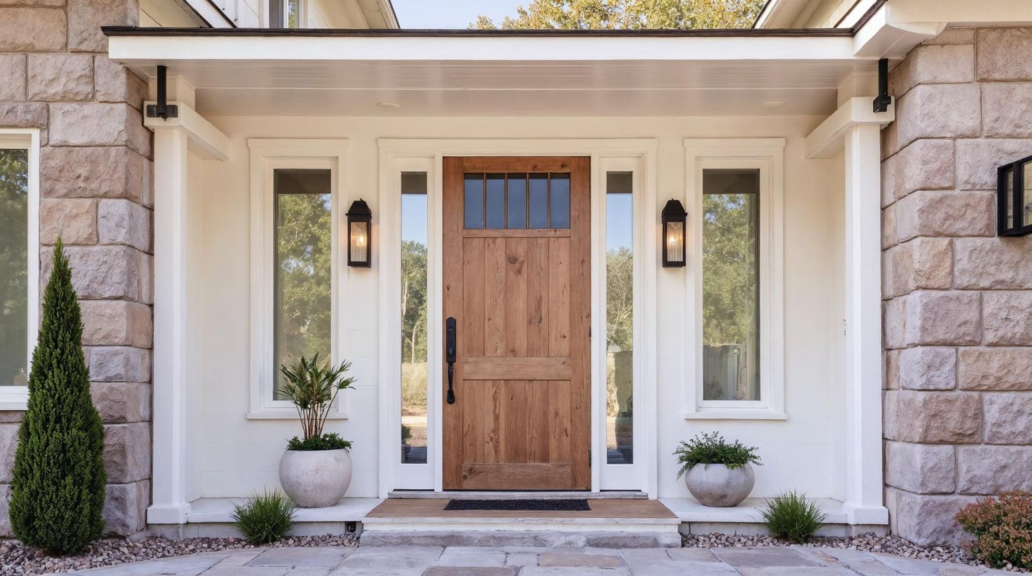
Beyond the pigment, the finish plays a massive role in interior paint design. Flat sheens hide surface irregularities but require more maintenance and weather faster. In contrast, satin, semi-gloss, and full gloss paints stay cleaner and look brighter. A full gloss on trim and front doors can be stunning.
Matching the gloss level to the room usage matters just as much as the color itself. Kitchens and bathrooms benefit heavily from satin or semi-gloss coats that wipe clean easily after cooking or showering. Bedrooms and living areas often look best with flatter sheens that absorb harsh lighting and create a softer atmosphere.
Finalizing Your Interior Palette
Matching the right tones to the right surfaces improves the daily experience of living in your house. Contact our office today to discuss your next interior project.
Share This Blog